UX DESIGN
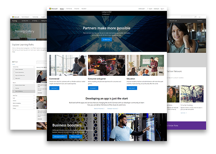
Microsoft Partner Network
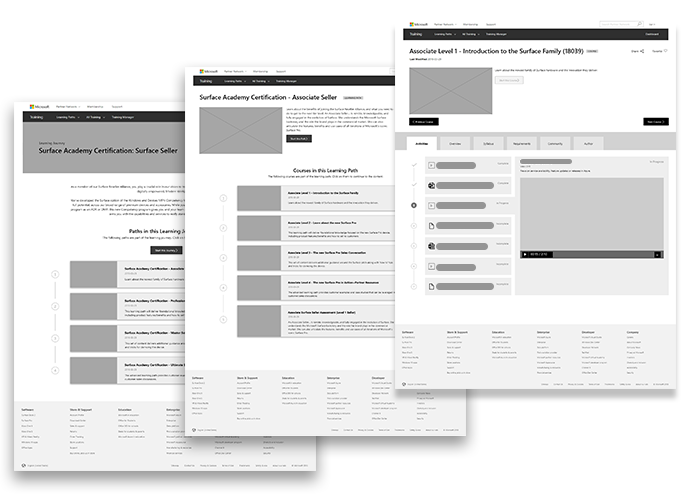
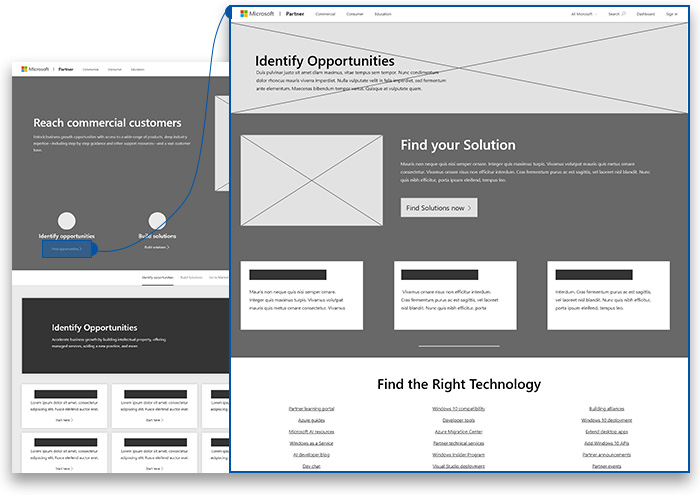
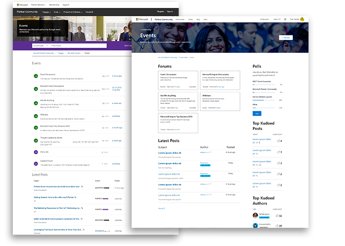
My team of UX experts helps to manage the user experience of partner.microsoft.com, a critical juncture for Microsoft's partnerships with other businesses. This site is the front door to a huge variety of businesses that rely on Microsoft technologies to sell their services.
My Team
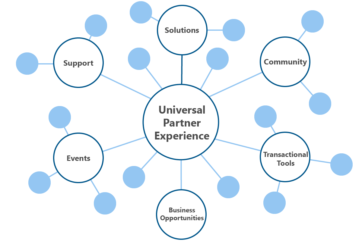
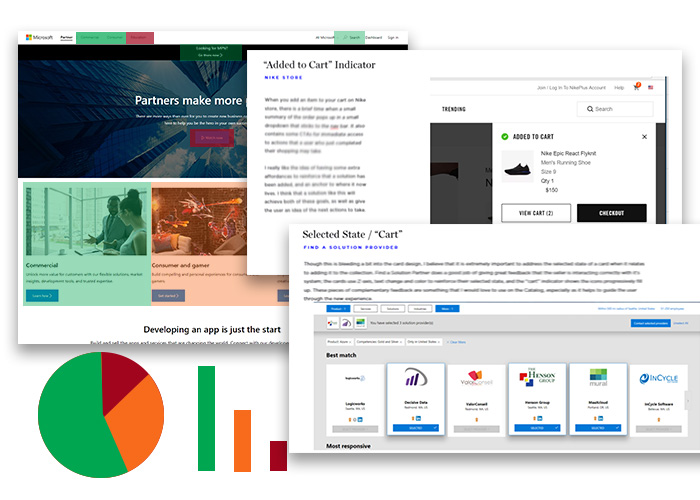
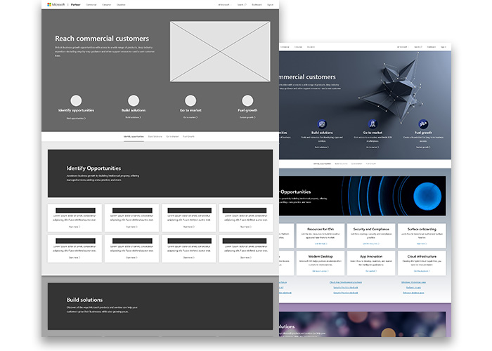
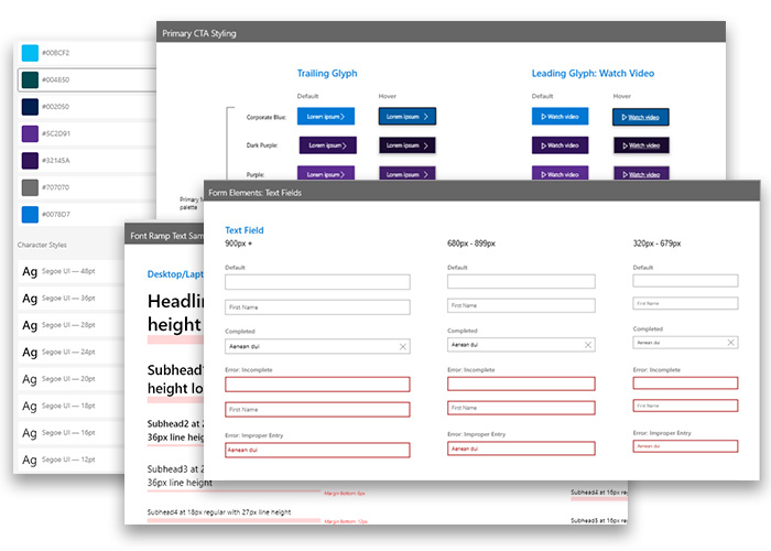
With a versatile set of user centered design skills and a streamlined release cycle, our nimble team improves the user experience for both the story being told on the front end, and the critical pipelines for engagement on the backend.
My Role
Personally, I contribute to the team as a User Experience Designer, bringing to bear my background in User Centered Design and a trained eye for visual design to deliver on time and above expectations.