"Our client at Microsoft managed a large enterprise repository for different marketing strategies that had been demonstrated as effective in their field."
This information is very valuable, as it would allow them to identify the best practices in the field and evangelize these throughout the organization. Participation in submission and consumption showed that their was a clear audience for the content. However, they had a number of problems with their preexisting framework that were making the service a chore to use. I was asked to come in to improve the process of the tool and the UX behind it. The first step was to do some research and lay the groundwork for the project through a bit of discovery.
Discovery
The main goals of the engagement was to create a tool that could improve the communication process between submitters and approvers, and make sure that the end result was pleasant to browse and share with colleagues.
We focused on 3 distinct audiences:
The Submitter
who has worked in the field and wants to contribute their success strategy to the organization.
The Reviewer
who evaluates the strategy based on a number of success criteria, makes sure there are no errors, and coordinates with the submitter to get the strategy approved.
The Consumer
who goes to the site to discover marketing strategies that have been approved and are relevant to the work they are doing in the field.
After we identified these three groups, I was able to sit down with them and discuss their needs for the marketing submission tool. At each step in the user flow there were some road blacks that were commonly lamented, and through our conversations and some usability analysis we were able to identify a few key pain points.
Pain Points
- Complex Forms Unwieldy submission forms that made it hard to understand content requirements of most fields, had poor error handling, and obscured the ability to revisit or edit pre existing submissions.
- Obscured Process Submitters were confused about the process of rating and cataloguing the submissions, and there was no visibility into the approval process.
- Excessive Manual Correspondence Multiple emails would have to be exchanged back and forth between submitters and reviewers to get changes and updates made, lengthening the process and taking up valuable time.
- Obtuse Reviewal System The approval process was very manual, and often resulted in the reviewers printing out the relevant information and doing analog markup.
- Clunky Interface The process for browsing the approved marketing strategies was clunky and did not show much relevant information, and the output was a poorly formatted slide deck that often obscured information due to limited content areas.
Design
"Design is a process; it requires an iterative approach and constant reexamining to make sure the product or service achives its purpose in a meaningful and impactful way."
Over the course of the process, designs become chiseled down from sketches and boxy wireframes into razor sharp expereinces that meet its users needs. This process can involve pivots, new perspectives, and sometimes complete reworking of a design. But it is important, as it allows a designer to identify flaws in a design early.
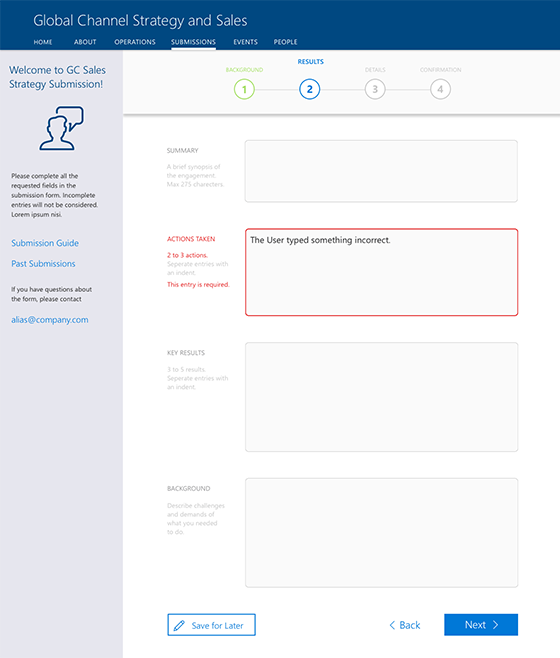
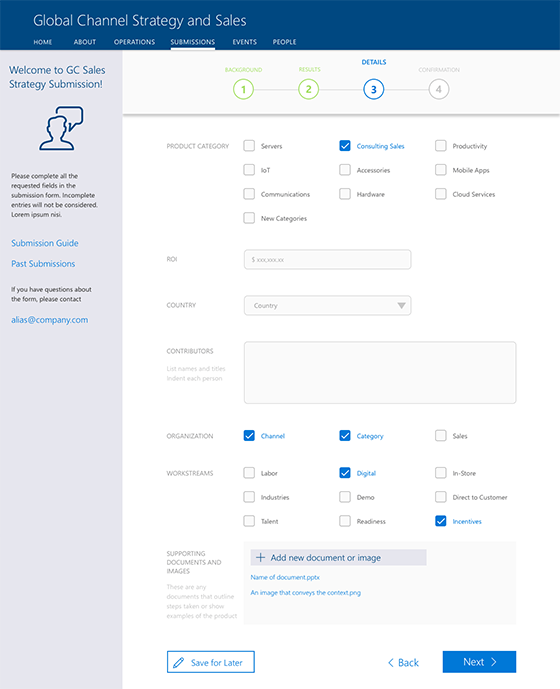
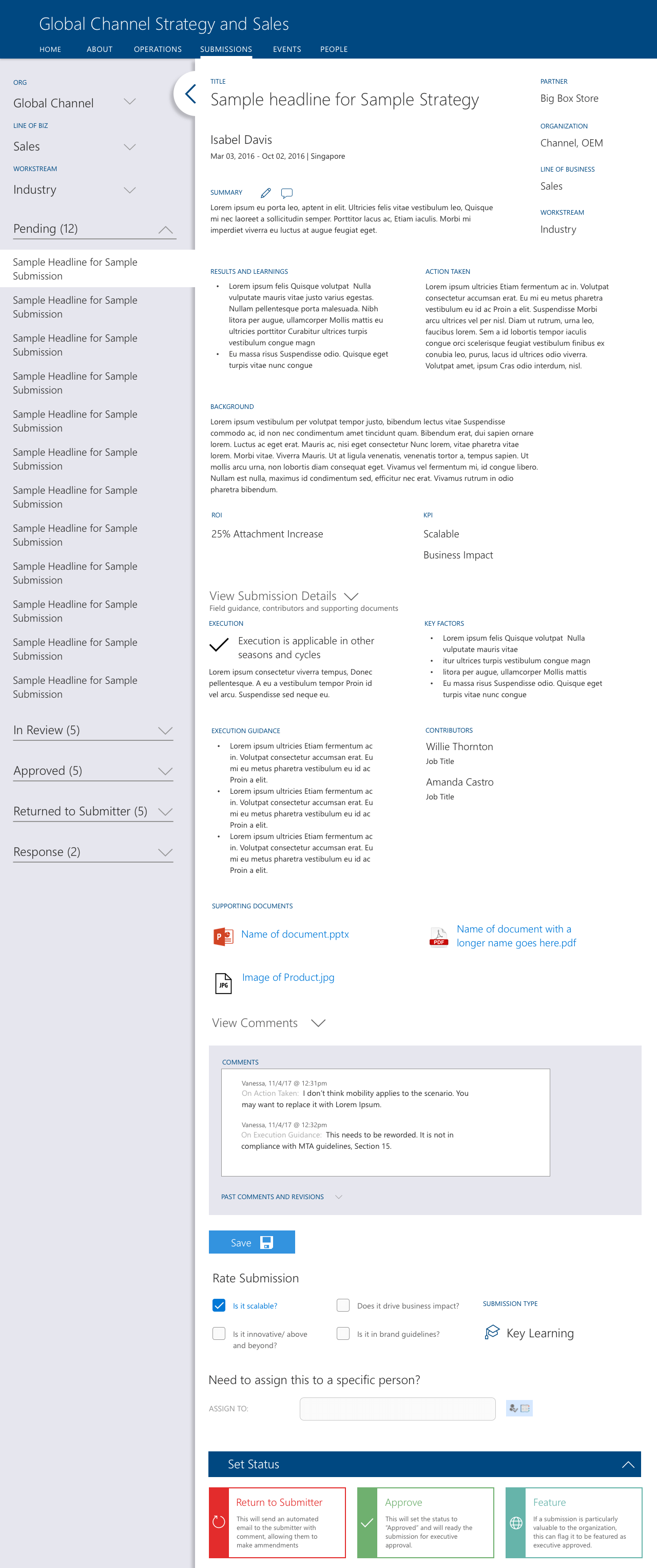
The approval experience went through the most amount of iterations, but it was also the most complex step of the submission process. Since manual back and forth of emails was a well documented pain point, I took strides to design a more automated experience. I did this by creating an "edit" and "comment" interaction for each form field.
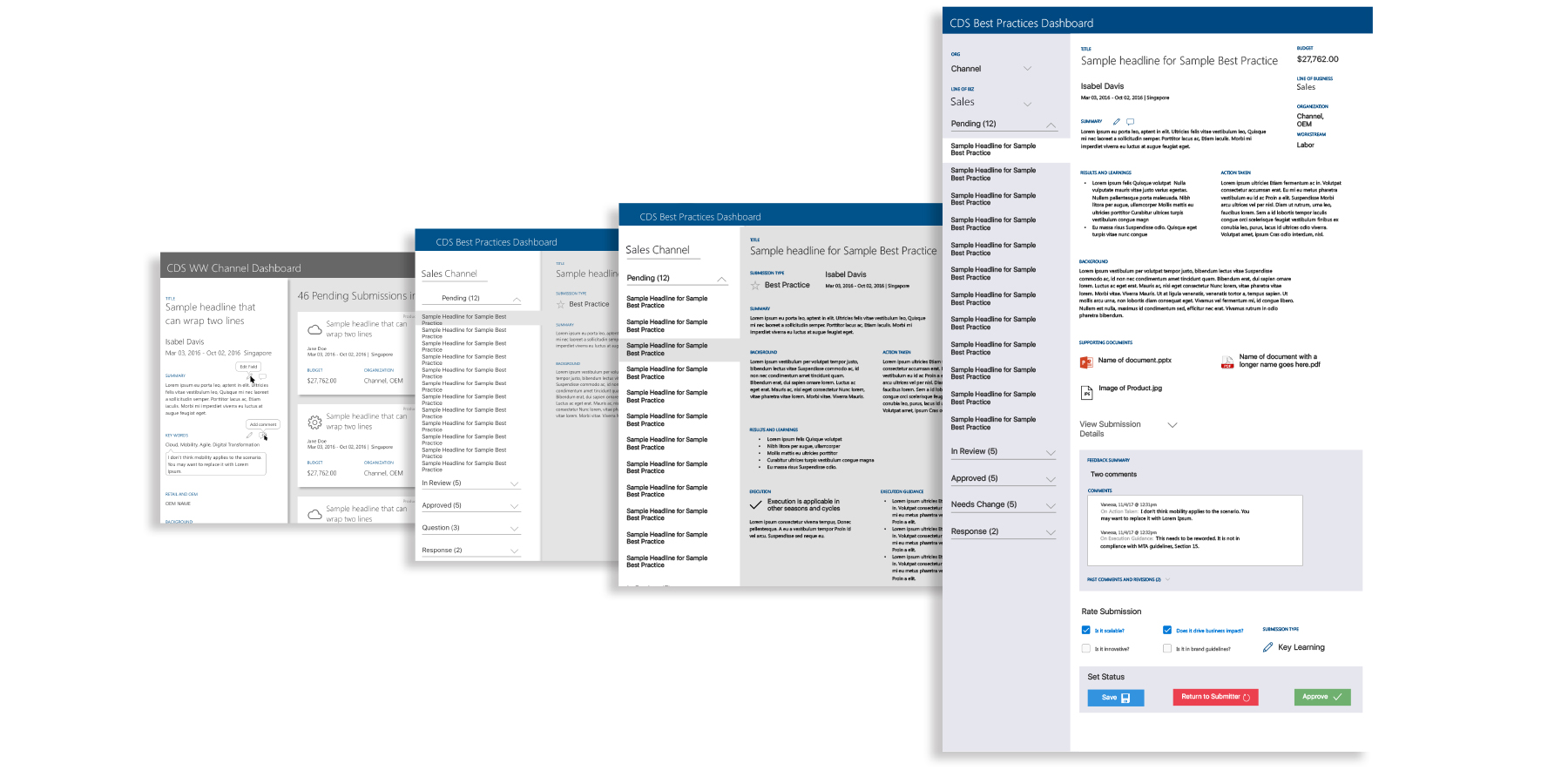
I began by creating sketches to nail down the kind of experience we would be looking for. I chose to try and use a modern card-based view for each individual submission. This would help it to remain clean and distinct when there were dozens of submissions in the queue, and the cards could easily accommodate responsive viewports with the help of a simple flexbox implementation.
Approval
When we were originally in the lo-fi page, I realized that there was a huge amount of real estate given to the submissions, yet they were largely inactive while the reviewer was auditing the content of the submission. In fact, the actual area that the interaction was taking place in was the sidebar, which was only a fifth of the viewport. We swapped the two; allowing the sidebar to house relevant submissions in a simple list view and the main area to accommodate the auditing experience for the reviewer. The card view later became the basis for submission browsing experience.
The reviewer can make notes on content that needs to be added or changed. These all get stored in a global field. If the reviewer chooses the interaction at the bottom to "return to submitter" an email is automatically sent with all of the captured comments and metadata included.
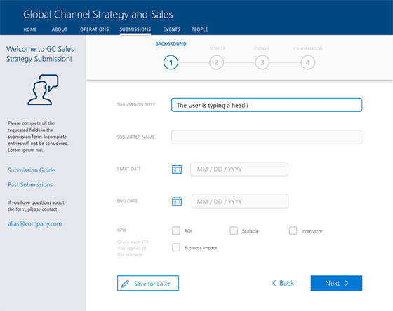
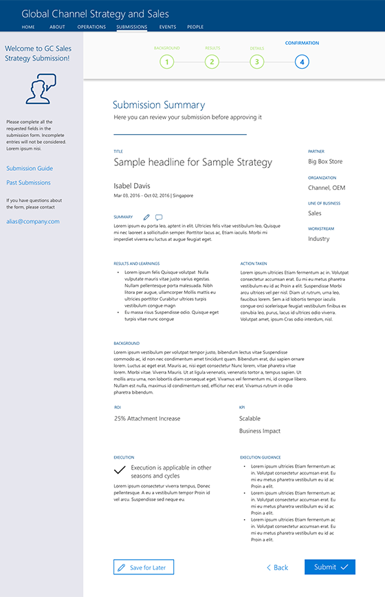
Form
The design of the form in the old version was claustrophobic, and used most of the field tags as placeholder text that would be lost as soon as the user engaged a form element. I created a more spaced out form experience; nesting relevant guidance along the way and giving the submitter plenty of space
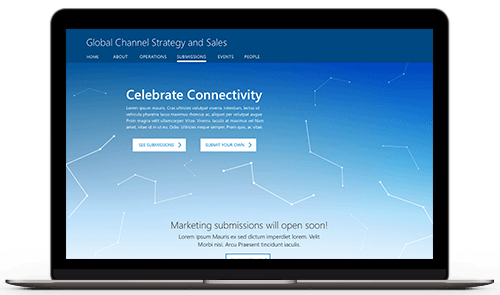
"The home page was designed to be clean and welcoming, and adopted a tone of celebrating the great work that had been done within the marketing org."
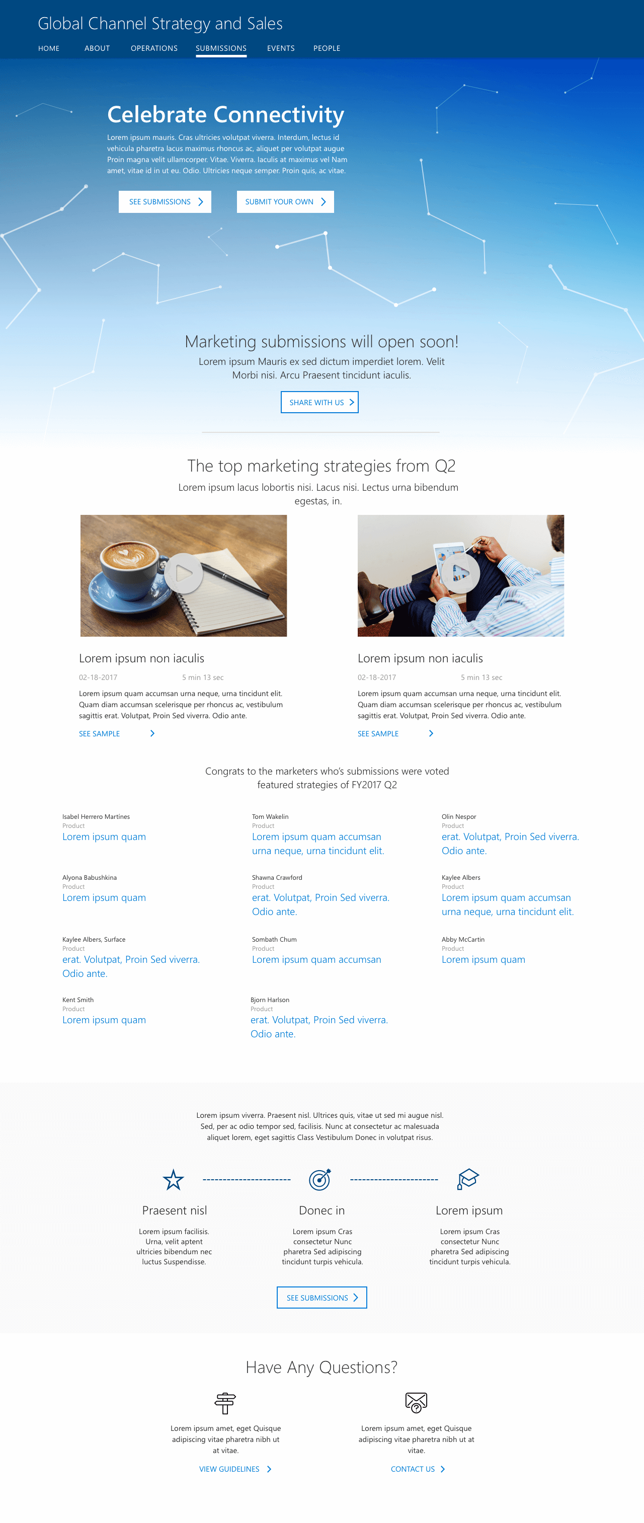
Home
The best submissions of each cycle are displayed on the front page. This makes it easier organization the consumers to view the top IP, and is a reward to the marketers that worked hard and put in a fantastic submission. The home page also gives some information to help acclimate the user to the system for rating submissions.
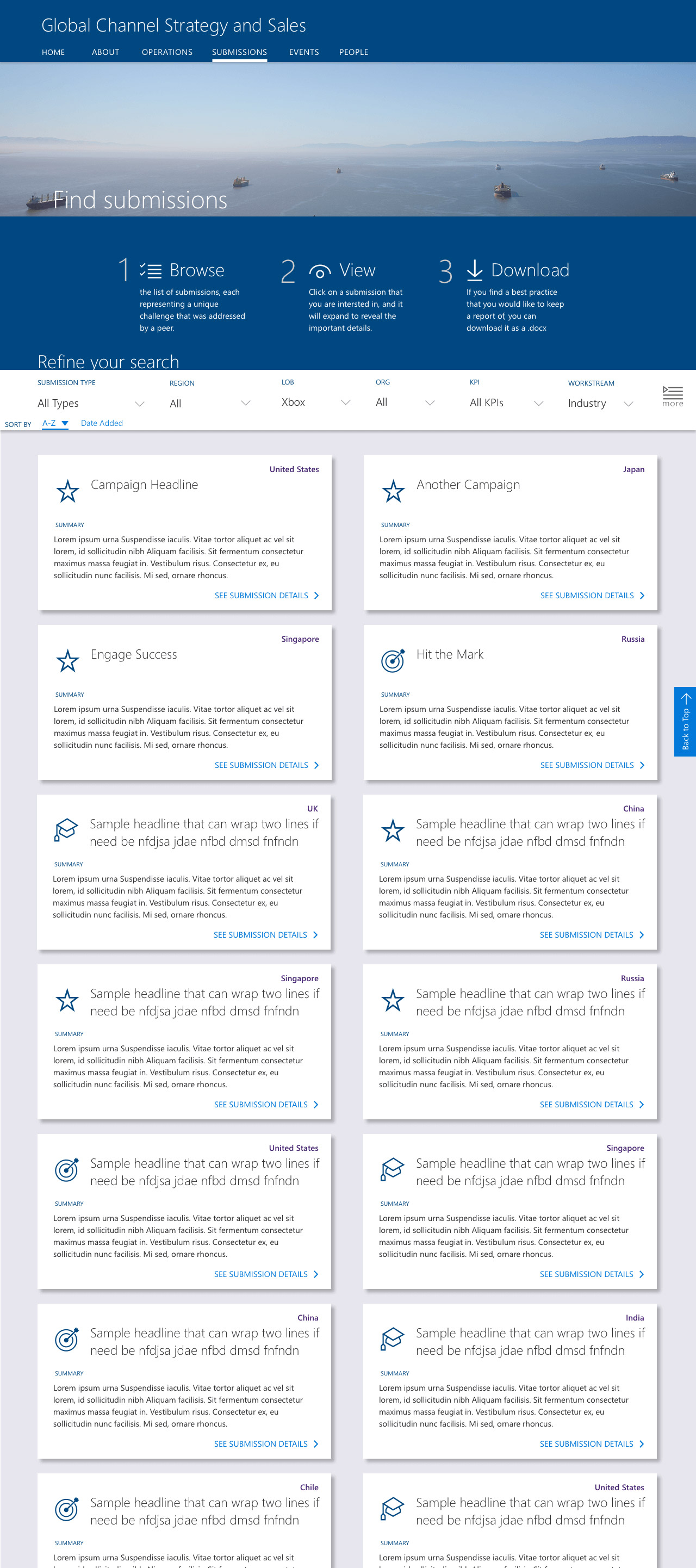
Browse
The browse page adopted the card layout that was initially explored, making it easy to view a large number of submissions. Some relevant meta data was highlighted, but ultimately the stakeholders chose to keep the layout clean to make it more of a "magazine-like" browsing experience, instead of convoluted screens of metadata.
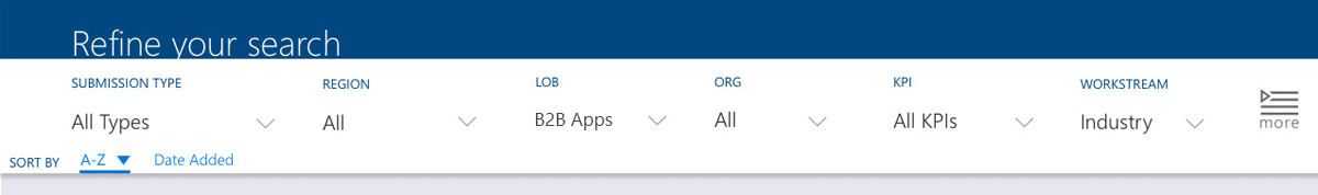
Rather than waste valuable viewport real estate by putting filter options on a sidebar, the filters were all nested in a responsive bar that stuck to the top as you scrolled past it. It held relevant filters and could be expanded to show more, but also progressively revealed more of those obscured filter options as viewports expanded from tablet to HD Desktop.
Prototype Early,
Prototype Often
"In the age of modern digital design, static comps don't work anymore. We are designing dynamic, interconnected products; it is important to pull them out of flatland early in the process to start thinking about it as a system."
In the end, we went through a large number of iterative changes that were informed by feedback from a number of design reviews with key stakeholders, as well as a user feedback group as well. The client was extremely happy with the product that we delivered on, and we have discussed options for further expanding it with personalization and data analytics down the road.
Here are a few benefits rapid prototyping brings to the table:
- Show Systems, not Screens As designers of digital products, we sometimes can get stuck in the view of focusing on specific screens, especially when those screens are the way deadlines are dictated. However, users do not see a product as a set of screens, they see it as a system that they interact with to reach their goals. When we prototype, we connect the disparate screens together and get a more comprehensive look at the problems we are looking to solve for them.
- Understand your User's Journey We create user journeys and flows to get a better understanding of the common paths that a person will take through a product or system. These should not be forgotten after the design phase ends. Prototyping allows you to test your design against user goals and see how it works, both internally and through testing. It will help you to see issues you may not have noticed while pixel pushing in Sketch.
- Sell Designs People like dynamic products that respond to their inputs in reinforcing ways; this does not change whether the person is on a couch at home or in a meeting room reviewing a product. In the same way that meaningful interactions can sell an end user on a product, a thorough prototype brings a design into context and can gain much more positive reactions from stakeholders and clients.
Results
In the end, we went through a large number of iterative changes that were informed by feedback from a number of design reviews with key stakeholders, as well as a user feedback group as well. The client was extremely happy with the product that we delivered on, and we have discussed options for further expanding it with personalization and data analytics down the road.