Over the course of many iterations, we designed and built a modular help system. Consistently styled, and allowing for catered in context help across a massive array of use cases, Custom Help Panes are a part of a huge step forward for ease of use in Microsoft enterprise products.
How the complexity of Microsoft's tools led to better help solutions.
In the world of enterprise apps, product teams are always dealing with a huge number of features and use cases, which can lead to managing a lot of complexity. On the Microsoft Power Platform, a lot of resources and effort are required to help our customers navigate these complex products so they can leverage it's powerful potential for their business. This effort can compound drastically when we consider the apps our customers end up building on top of our products to solve their unique business needs.
As we have gained growth in our user base and anticipate a large surge of new users in coming semesters,our product teams realize that we will need better systems to get our customers plenty of assistance with learning the in's and out's of leveraging the powerful tools at their disposal. An important part of this greater effort, Help Panes were born out of a need for a consistent place users can always find in context help.
The Team
UX Manager
Project Manager
UX Designer
Engineers
Content Designer
User Researcher
My Role
UX Designer
Work with research to formulate a plan for what user needs must be solved.
Work with engineering to determine what features are in and out of scope for the given phases of production.
Iterate on multiple design concepts and review them with stakeholders to gain consensus.
Ensure the components are on brand and align with the greater product help strategy.
Work with content and design leadership to establish help panes as a repeatable component; ensuring consistency and alignment across products.
Consider accessibility and document the patterns for making sure the component can be universally accessed.
Key Insights
Gathered from research and discovery analysis into the customer and their jobs to be done.
Pain Points
Current help resources only provide generic links not relevant to the tasks at hand, forcing the user to forage for their own guidance.
Inconsistent use of components to provide in-context help in our products leave users without reliable patterns for help they can learn to trust.
Lack of content strategy leads to no real consistent approach for how to show documentation and links in help surfaces.
User Needs
Third party partners need a way to author help for their apps, in a way that is quick and easy.
It is important to be able to accommodate a huge amount of potential content, as help panes may be used across many industries and products.
Our customers want help when it is relevant to the task they are in, and can quickly unblock any obstacles they have.
Creating the Surface
Considering the needs of our customers and the constraints they worked within, we set right to work determining the best surface that we can create for help in our product. At this early phase, it was important to make sure that we could sell a concept that made sense for both the interaction design and the technical implementation.
To achieve this, I worked closely with an engineer to rapidly iterate on the concepts and create a full code MVP that we could use to validate with our stakeholders and customers. We produced the first help pane as a prototype in a test environment, and this allowed us to gain quick feedback to determine how the surface should be used.
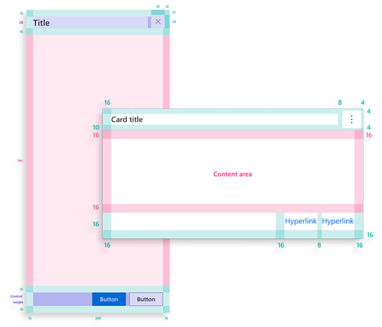
We created the help pane component with the following criteria:
Leverage existing components
Creating the help pane using some of our basic surfaces as atomic parts of the component gave us two benefits; it became much easier to implement less net new work was needed to create it, and we also were able to match the brand and style of the similar surfaces that appear across Microsoft's product line.
One common entry point
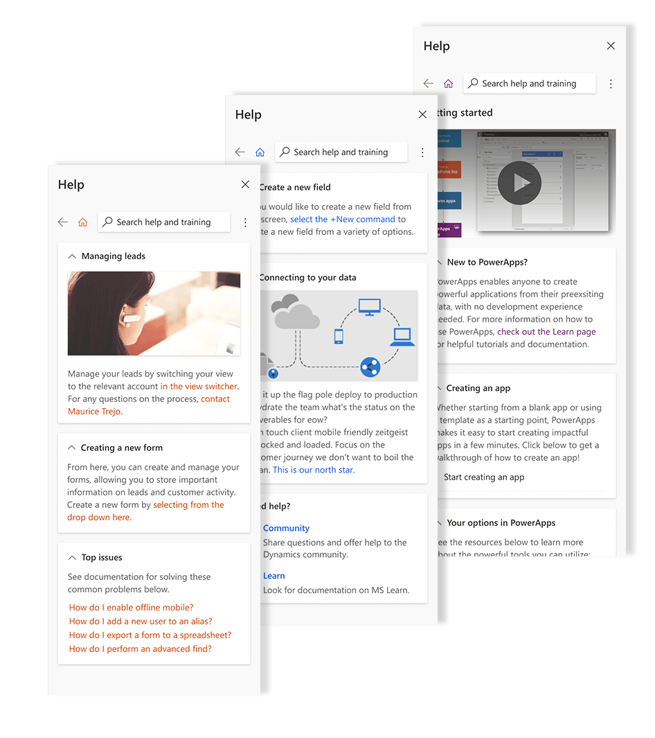
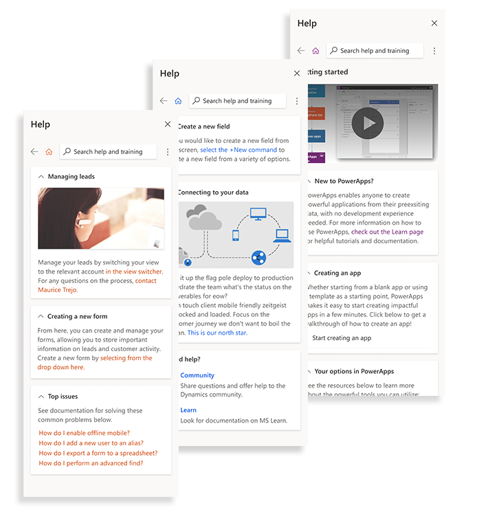
The entry point for the help pane is global and consistent. It can always be found in the top right corner.
One surface for help across every use case.
The pane will be used across a massive range of applications and use cases. Flexibility and scale were at the core of every design decision.
Accomodates theming based on product
It was important to allow help panes to be themed to the product that they are featured in. Be it Power Apps, Power Automate, or a third party company with its own brand, the pane matches the brand of it's product.
With this criteria, we were able to create the first MVP of the help pane. However, this was only the technology that would operate as the backbone of the help experience. The biggest job would be developing the content strategy, and to do that effectively at scale, we would need to increase our collaborators substantially.
Designing at Scale
So now that we had our prototype spun up, the real work of creating the pattern started. We were working within the context of Microsoft Power Platform, consisting of it's most powerful business productivity softwares, and catering to the way that they can work together to give our customers incredible innovation.
For custom help panes to succeed, we needed to be design ambassadors to each product so we could address their unique needs. We put together a team of designers, content writers, and PMs to have these important discussions and synthesize them into the design.
Here are a few examples of these collaborations:
Opportunity Identified
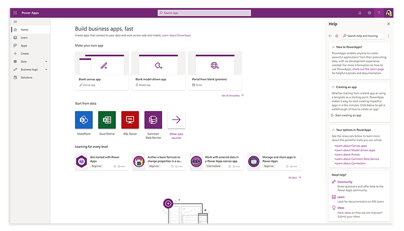
Show walkthroughs for complex tasks
Power Apps is a low code platform for taking data and rapidly transforming it into useful apps. It has many powerful features, but also requires a lot of understanding of the product to best utilize the tool. By overlaying walkthroughs directly on the UI as the user works, we were able to solve for that complexity while keeping the user in context.
Opportunity Identified
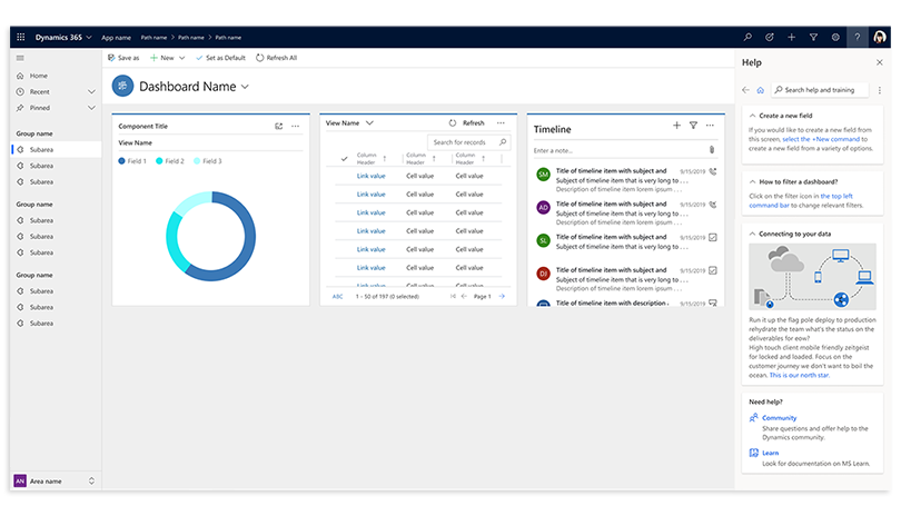
Offer help as a service
A key consideration was our partners who are building their own business apps on the Dynamics 365 and PowerApps platform. By building help panes with easy-to-edit authoring tools while remaining fully customizable, we can empower the admins at our customer companies to provide help directly in the app to their own employees who use it.
Opportunity Identified
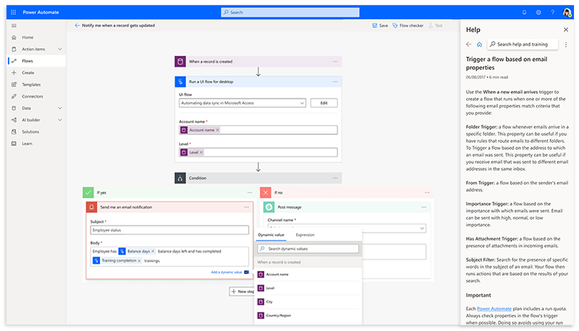
Bring documentation in context
Flow shows a lot of variables and features to their users in the authoring space, and yet the main source of information on what they are is tucked away in a separate documentation site. These scenarios showed us the great potential in being able to dynamically bring that docs content into the help pane, allowing customers with questions to get the relevant article without leaving the context they are working in.
Opportunity Identified
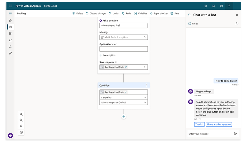
Search and bots can assist in support
It will be impossible to put every piece of relevant help for a product into a help pane. We worked on creating a search feature so customers can look for their own answers. Power Virtual Agent helped take us a step further, looking at situations where we can divert users from search into a bot experience that walks them through the process of getting support.
Opportunity Identified
Search and bots can assist in support
It will be impossible to put every piece of relevant help for a product into a help pane. We worked on creating a search feature so customers can look for their own answers. Power Virtual Agent helped take us a step further, looking at situations where we can divert users from search into a bot experience that walks them through the process of getting support.
This phase was where we spent the majority of our time and effort, and for good reason.
Designing in a large enterprise setting can often take a lot longer than at smaller companies or an agency, and this is specifically due to needing more buyoff from the many products and stakeholders. However, this pays off in the long run, because gaining visibility and clarity early in the process means that you run into far less hitches later on. Indeed, our effort in cross-team collaboration meant that we were able to get universal consensus and iterate the help pane into a very useful tool. This allowed us to move into finalizing the design unimpeded.
Finalizing the Patterns
With all of the effort of creating the design complete, the next step was to take all of that and turn it into a pattern that any team could easily find, understand, and consume, both for design as well as for engineering. The concept of having a pattern library is extremely important at Microsoft; it allows cross product consistency and is a massive time saver.
We partnered with the designers and engineers who owned the component library on their respective sides. We worked through the designs to double check that they aligned to Microsoft's Fluent Design Language. We then were able to work them into our toolkit with large amounts of reference material, turn them into repeatable patterns in the team Figma library, and upload the surface into the groups code repository.
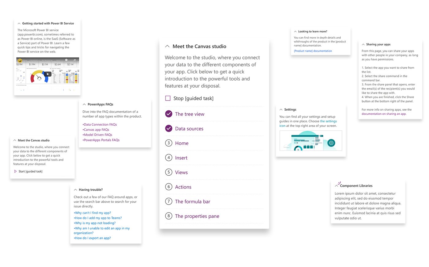
Here are some of the additonal patterns we documented for help panes:
Help Content
"Help" in a digital product is all about providing relevant content and making it easily accessible. Our prior collaboration with content designers and learning experts was a key part of determining what media and interactions we needed to accommodate for.
Based on our design process, we prioritized supporting the following content:
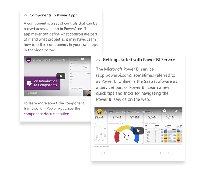
Videos
Videos can be a great way to share a lot of info around a help subject with both visual and auditory guidance. Considering that panes are limited by their short width, videos can be a great way to provide a lot of help in a space efficient format.
Photos
A picture is worth a thousand words! Photos can be a great way to reinforce a concept; such as having an illustration that can help to convey an abstract process or an interaction in the UI.
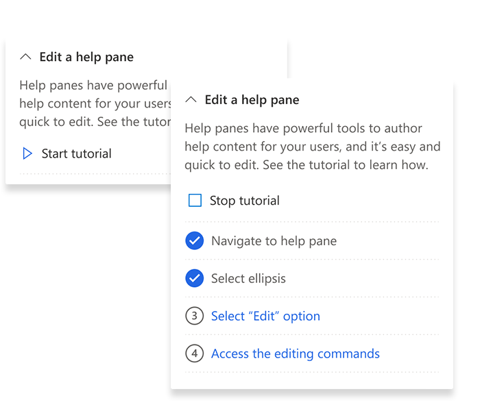
Guided Tours
Due to having the entire page experience still open while the pane is engaged, Help panes can be an excellent place for users to get information that points exactly at the page elements needed to complete the task. A guided tour can link multiple teaching bubbles together to explain a complex task or process by pointing to the actual interface!
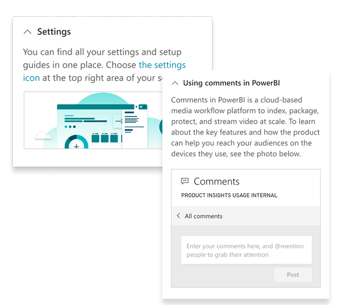
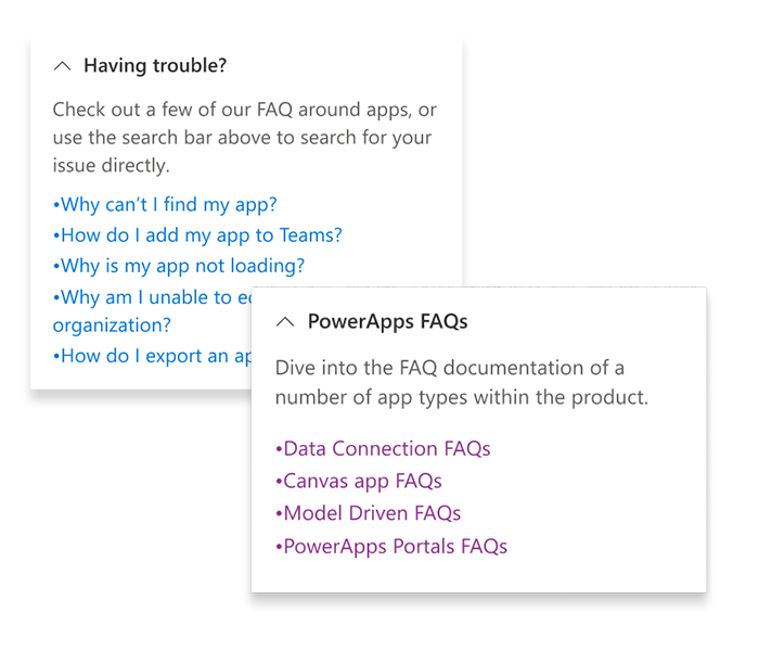
Documentation
Documentation is a perfect complement to the quick, task focused content in the help pane. Whether through featured articles or supporting search across the product documentation site, the Help Panes bring relevant documentation directly to the user.
Help Authoring
Designing authoring controls based off of our customer needs.
For custom help panes, we not only had to think about the way that it would be presented to our end user, but also about how it will be authored and updated by the admins and content designers who write the help content itself. The focus was on simplicity and ease of use, so our partners can get help in their apps with very few barriers.
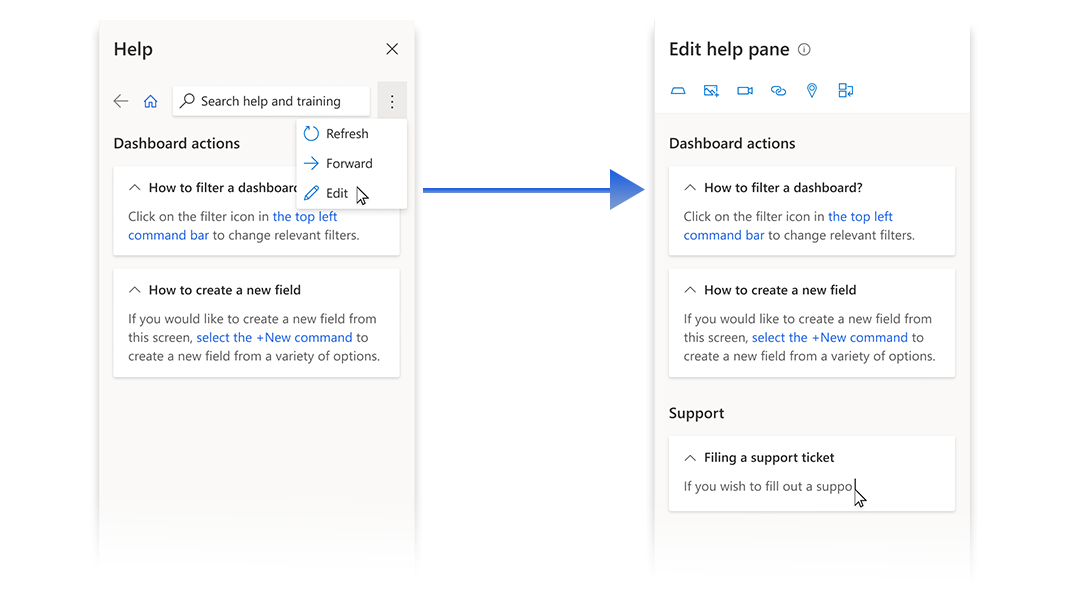
The secret behind the ease of editing is that Custom Help Panes are modified with a WISIWIG (What You See Is What You Get) editor, allowing admins with proper editing privileges to modify the content inline and see exactly how it will display in the end result.
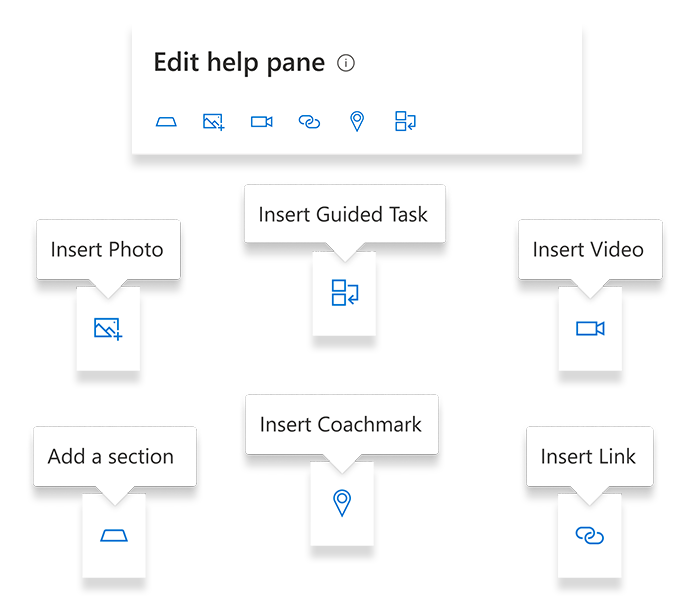
Insert diverse content
Authoring Control
Each of the unique content types have controls for inserting them, allowing for a modular, familiar editing experience similar to a rich text editor.
Format inline
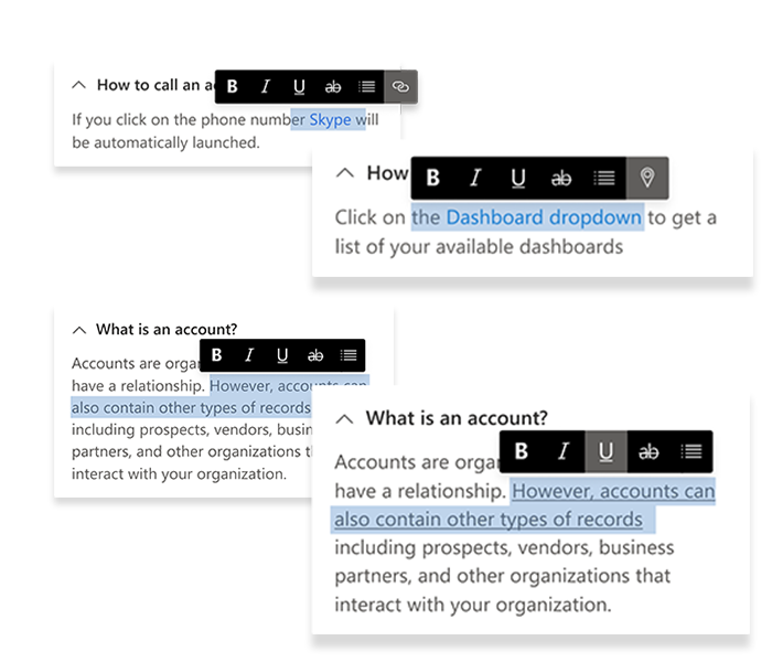
Authoring Control
Inline editing bubbles allow you to change text properties directly in the canvas, as well as make changes to the media you have inserted into the sections.
The project in retrospect . . .
While working on a product feature tends to revolve around focusing on the optimal way to perform some specific tasks that are critical to a job, designing the Custom Help Panes was much more about creating a system. With the variability of content at hand, we could not anticipate all of the things the pane may display, so we focused instead on creating a flexible system, and then providing best practices for the authors of the content so it can remain consistent and useful.
Working closely with the engineer, we were able to quickly iterate on the concept and create a fully functional prototype. This was useful for sharing around with the various stakeholders and gaining consensus on the component. This quick turn around to a usable product was an excellent exercise in agile development and testing.
I was also able to lead a group, composed of designers and content experts, that defined the specific behavior and patterns around the Help Pane. We then generated guidance on this for our internal teams to leverage and build off of. This was an effort I was proud to take on, as it helped me to better understand the process it takes to bring a component to a consumable state, as well as being a wonderful opportunity to improve my leadership skills.
I am very proud of my team and I's work on the Custom Help Panes, and from the process I learned so much about how to design better help experiences in digital products.