The Problem
The successful use of a Customer Relationship Manager (CRM) is reliant on being able to draw from data that is clean and up-to-date. Unfortunately, this is a place where many nonprofits can struggle; they have a large amount of disparate flat files that need to be uploaded from many different third party sources, each with different structures for the data. But for donation transactions, the lifeblood keeping nonprofits at a functioning revenue, it is crucial that these donations are accurately represented in their CRM.
As we have gained growth in our user base and anticipate a large surge of new users in coming semesters,our product teams realize that we will need better systems to get our customers plenty of assistance with learning the in's and out's of leveraging the powerful tools at their disposal. An important part of this greater effort, Help Panes were born out of a need for a consistent place users can always find in context help.
As we have gained growth in our user base and anticipate a large surge of new users in coming semesters,our product teams realize that we will need better systems to get our customers plenty of assistance with learning the in's and out's of leveraging the powerful tools at their disposal. An important part of this greater effort, Help Panes were born out of a need for a consistent place users can always find in context help.
Discovery
To identify where our current import solution was failing, I started by mapping out each step of the current user journey to upload a file; representing each interaction that a user would have to take as a step in the process.
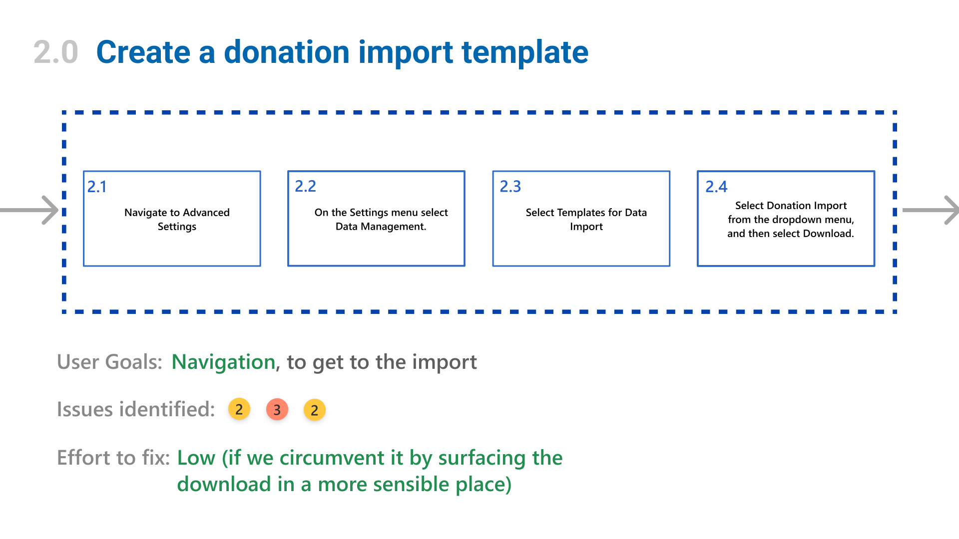
Then, I went through and performed a heuristic analysis on each stage; comparing it with usability standards for our products as well as common standards for the Nonprofit domain. For each area where the experience fell short, I assigned it a severity rating from 1 to 4: the former being a small annoyance or low priority bug, and the latter being a critical error that would block the experience from being usable at all. We reviewed this with the team and discussed the findings, as well as assigning each error a technical level of effort to address.
By leveraging the evaluation, as well as feedback from our support tickets and customer conversations, we were able to find out some of the top pain points in the experience:
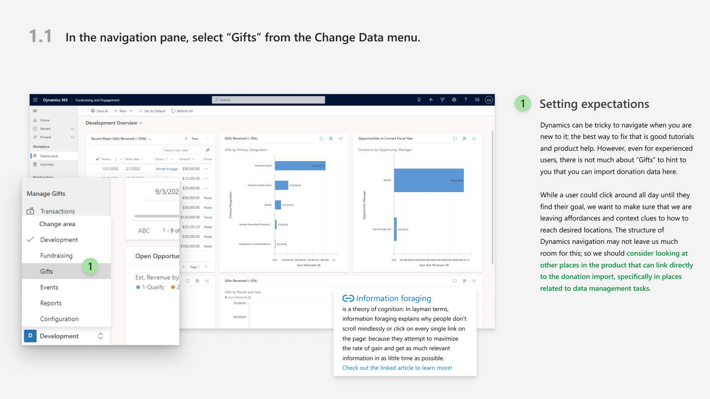
Poor Discoverability
A combination of poor wayfinding and an excessive amount of clicks to access important resources were making it far more difficult than it needed to be to find the donation import.
Bad UX writing
Microcopy to reinforce the correct way of importing and identify errors was very poor, leaving far more ambiguity than was needed.
No insight into bad data
Errors in the imported data or in the mapping was not flagged during the import. There was no visibility into what would fail in an import before you do it.
Designing a Solution
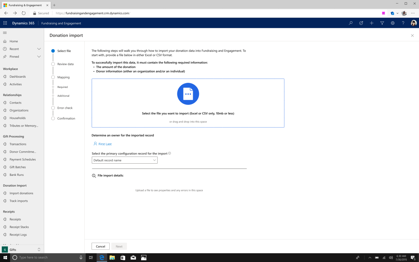
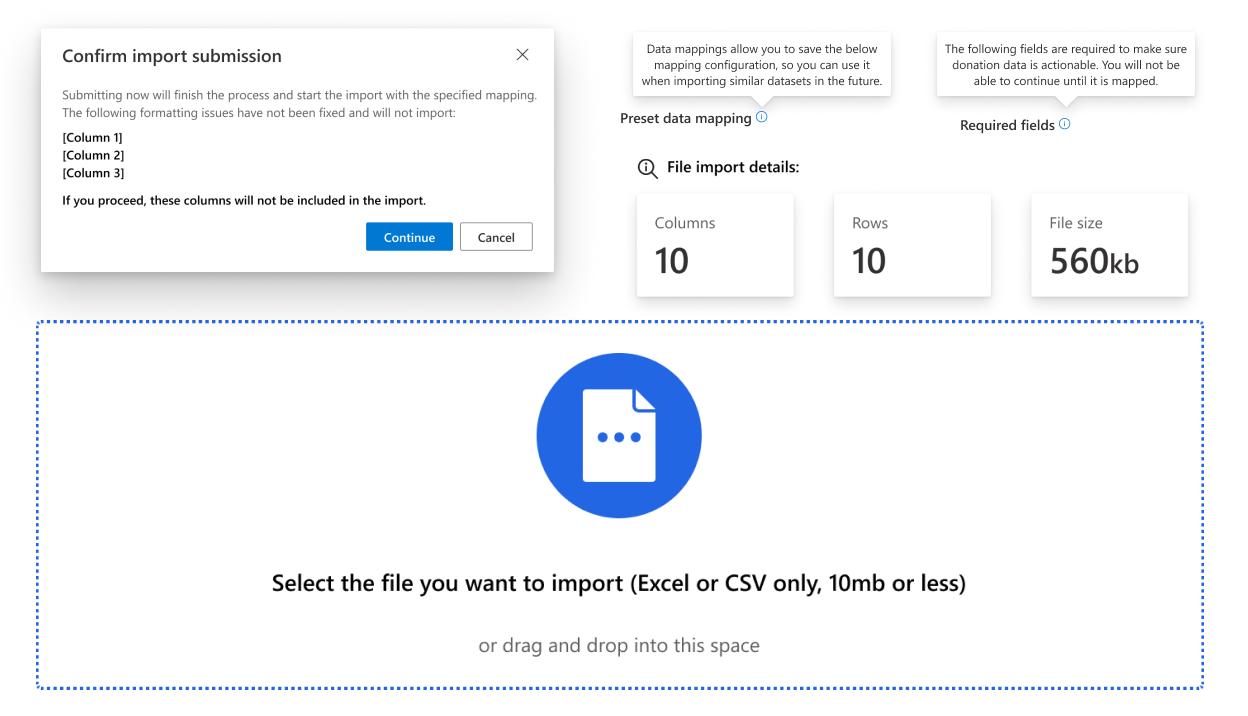
A view of the file import. A big improvement here was the inclusion of better copy to reinforce the correct data and specifications that would be required of the file. We also added in a better import interface and a preview of the file details when it is attatched.
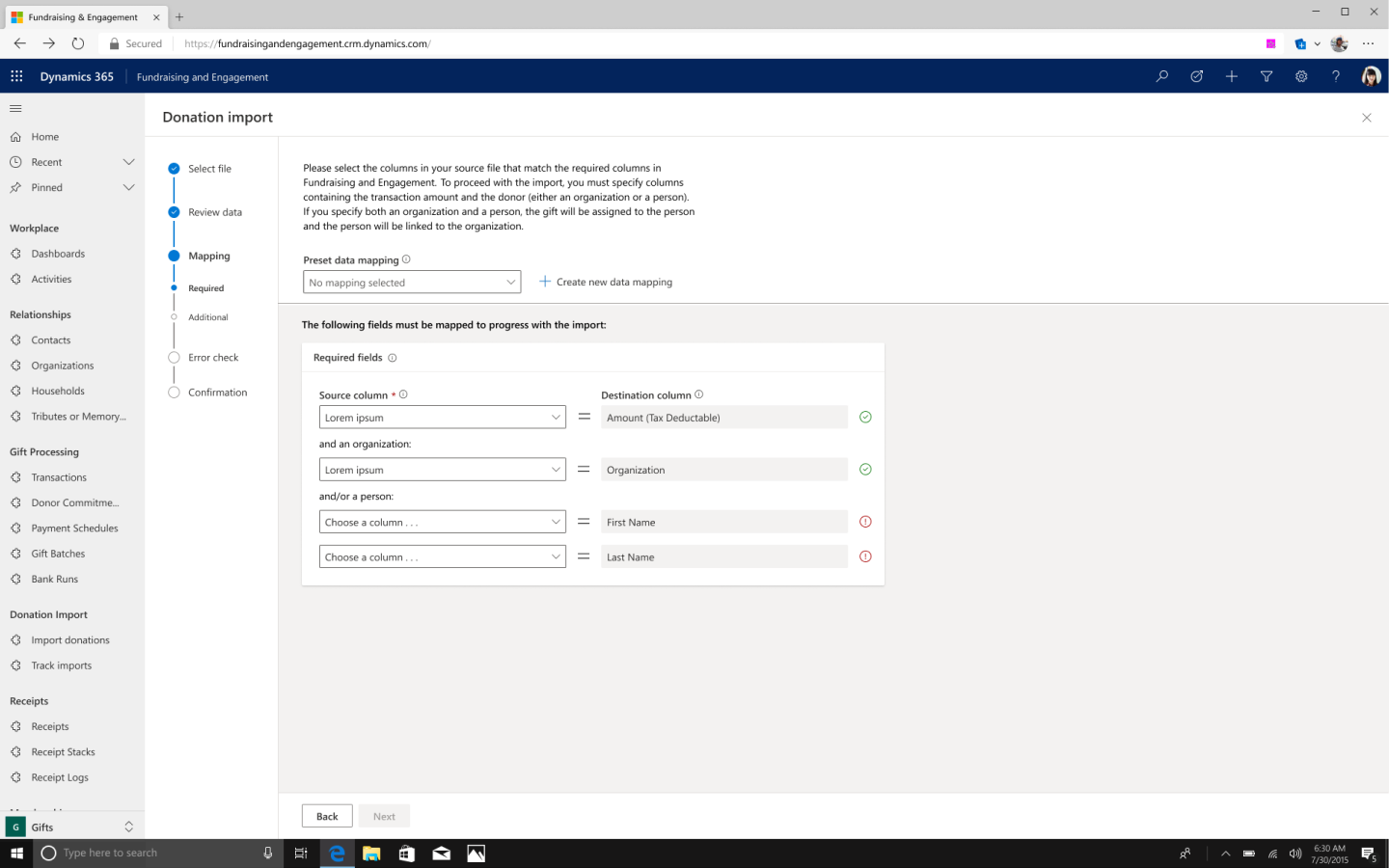
This is the screen for the mapping, a very important step in the process. Adding in the preset data mapping function was a huge step forward; customers could save data mappings from a session, and then load them in later sessions if they had a similar import file.
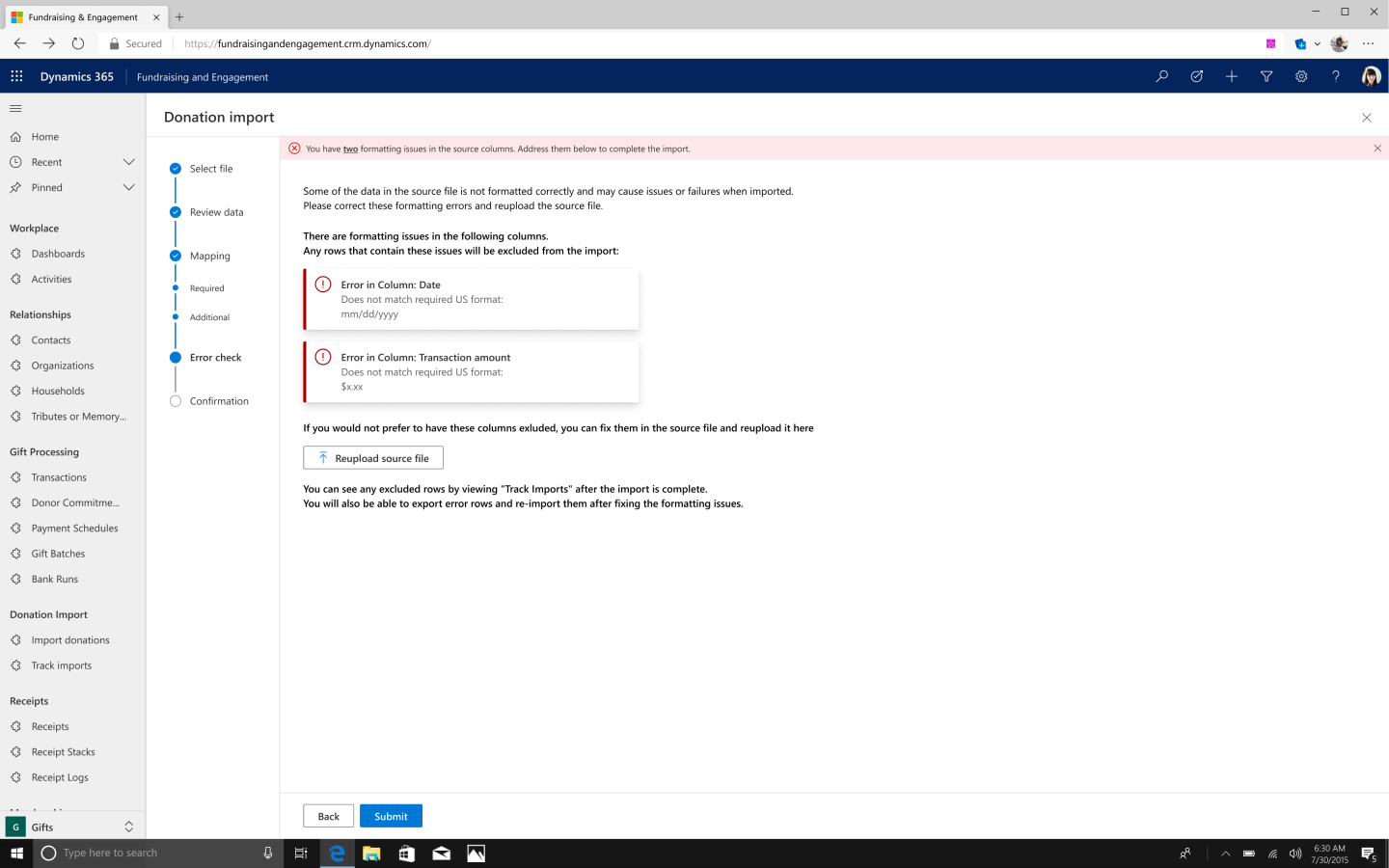
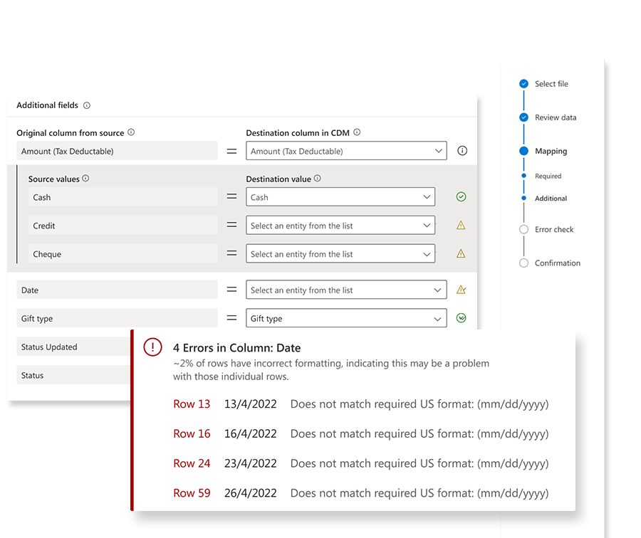
The biggest inclusion we made to the process was better error handling. This was entirely missing from the previous version, and allowed us to flag data issues for fixing before the import actually started. This would help to educate on the standards required by the CDM and cut back on bad data being added to the program.
Simplified Discoverability
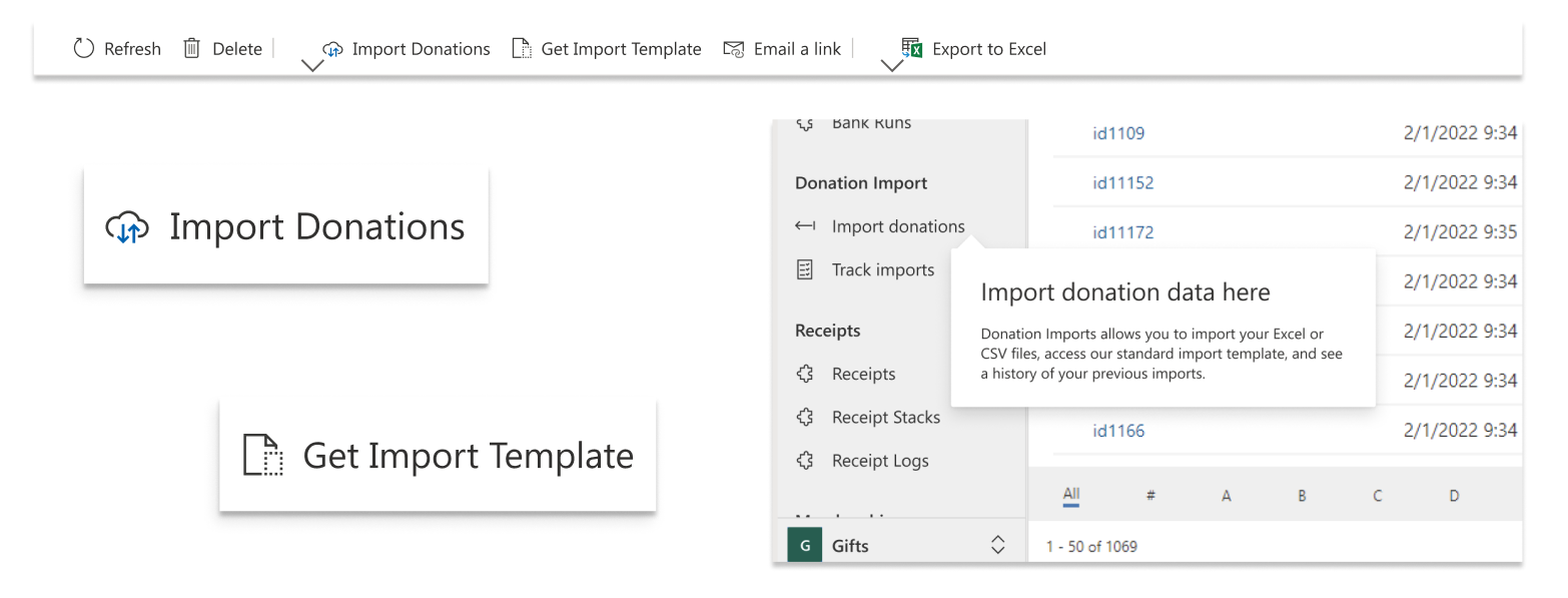
Increasing the visibility of the import options, cutting down on steps that it took to find the templates to assist with importing, improving the entry points, and adding in pages to clearly track imports all helped to make it much easier to find and use the donation import feature.
Better communication
Completely rewriting all of the microcopy and guidance for this feature allowed us to signal things like upload limits, error messaging, and required data attributes that were previously left obscured. Adding in help tooltips allowed us to give definitions and guidance when the customer needed it. We even added in file previews, so customers have a chance to make sure they are uploading the correct document.
The project in retrospect . . .
The donation import redesign was a great step towards a better data journey for our customers; making it easier to get their data into the system meant that we could then begin to build tools that give insights on that data with more confidence. This project really served as a reminder that you do not need revolutionary design patterns to solve problems; some of the most effective updates that we did here were just about simplifying the journey to get to the import, as well as reinforcing it with better content and interactions.
It was also certainly interesting to learn more about the world of data cleanliness in CRMs. Nonprofits are such interesting customers to design for because they all have such different mission types with vastly different structures, so we got to see a lot of unique challenges in this area. It stands out as a key barrier for a lot of nonprofits who are looking to modernize, so the work that we did here can really be seen as just one more step towards making these powerful tools as accessible as possible to some of the most important organizations on the planet.